OUR WORK
Holborn Corporation:
A Comprehensive, Full-Service Case Study
e9’s tagline is “We Build Websites that Build Businesses.” For this assignment, however, our team showed the full scope of our marketing and design skills—creating a dynamic, comprehensive rebranding project for a national client.
First, Our Marketing Got Their Attention
Holborn found us through an online search, liked the look of e9digital’s website as well as our approach to web development and marketing and then quickly reached out to ask for our help.
Though this privately-held reinsurance company dates back almost 100 years, they had virtually no marketing experience when we began working together in 2014. Holborn’s success was a strong testament to their reputation within the industry and word-of-mouth referrals, but, as the firm approached its Centennial, it was time for a few changes.
They Started with an App…
Initially, Holborn didn’t even approach e9 for our branding and marketing capabilities; their IT department needed a file sharing web application for key clients.
More than a basic app, they required a proprietary portal for client file-sharing, similar in some ways to the popular “Dropbox” application, but much more secure. Working from the ground up, e9’s New York-based software engineers (all with 10+ years of experience) met Holborn’s detailed specifications, and completed the project—including quality assurance, testing and debugging—on time and on budget.
“The clients love the app. It’s so simple to use, we don’t even have to send instructions.”MARK HOPPER | Vice President & Head of IT
Okay, Let’s Do This!
Their team was so pleased with the ease and effectiveness of our app that Holborn and e9 broadened the conversation to include the other half of our talents — creating a new website and overall corporate rebranding.
They readily agreed to move forward.
The Client Gets Its Colors Done
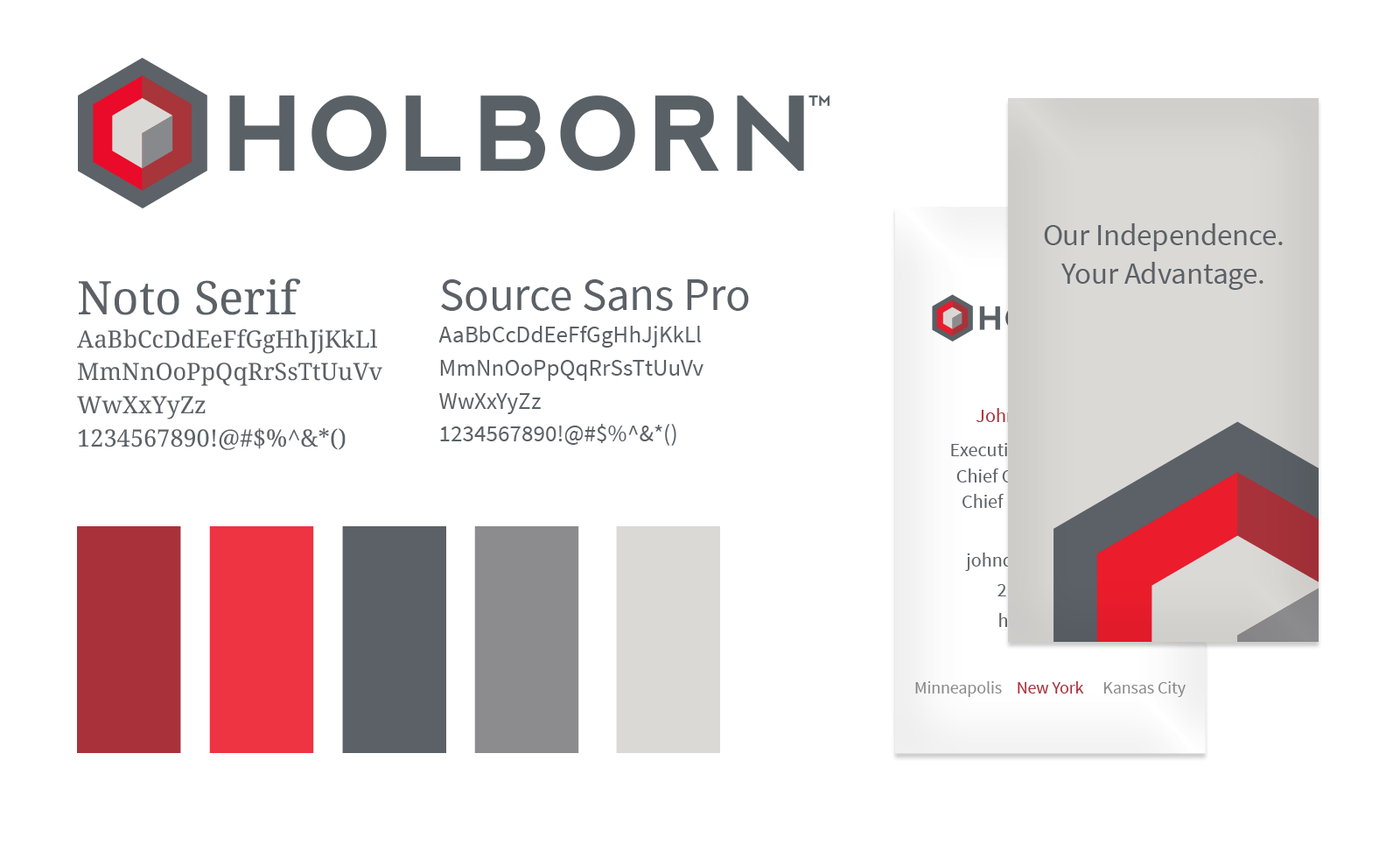
Our first assignment was to develop a logo, tagline, typeface, and core color scheme to unify all aspects of Holborn’s marketing and corporate identity, from letterhead, business cards and interoffice digital documentation to its new website and future marketing materials.
Hitting the Bulls-eye
Holborn’s staff includes Ivy League MBAs and attorneys. They’re smart, extremely analytical people, but marketing was new to them. So, for the process of building brand identity, we began with the basics, but with a full understanding of Holborn’s market and the corporate culture we were working with.
e9’s typically methodical approach matched Holborn’s perfectly. We developed and presented concepts in three separate rounds, beginning with an “exploratory round” that we equate to a visual questionnaire which offers clients the chance to help translate complicated verbal concepts into visual ones.
As we narrowed down the choices, both e9 and Holborn realized the client truly wanted and needed more than a “fresh logo”; they needed an icon, one worthy of a respected industry stalwart on a professional plane with Lloyd’s of London.
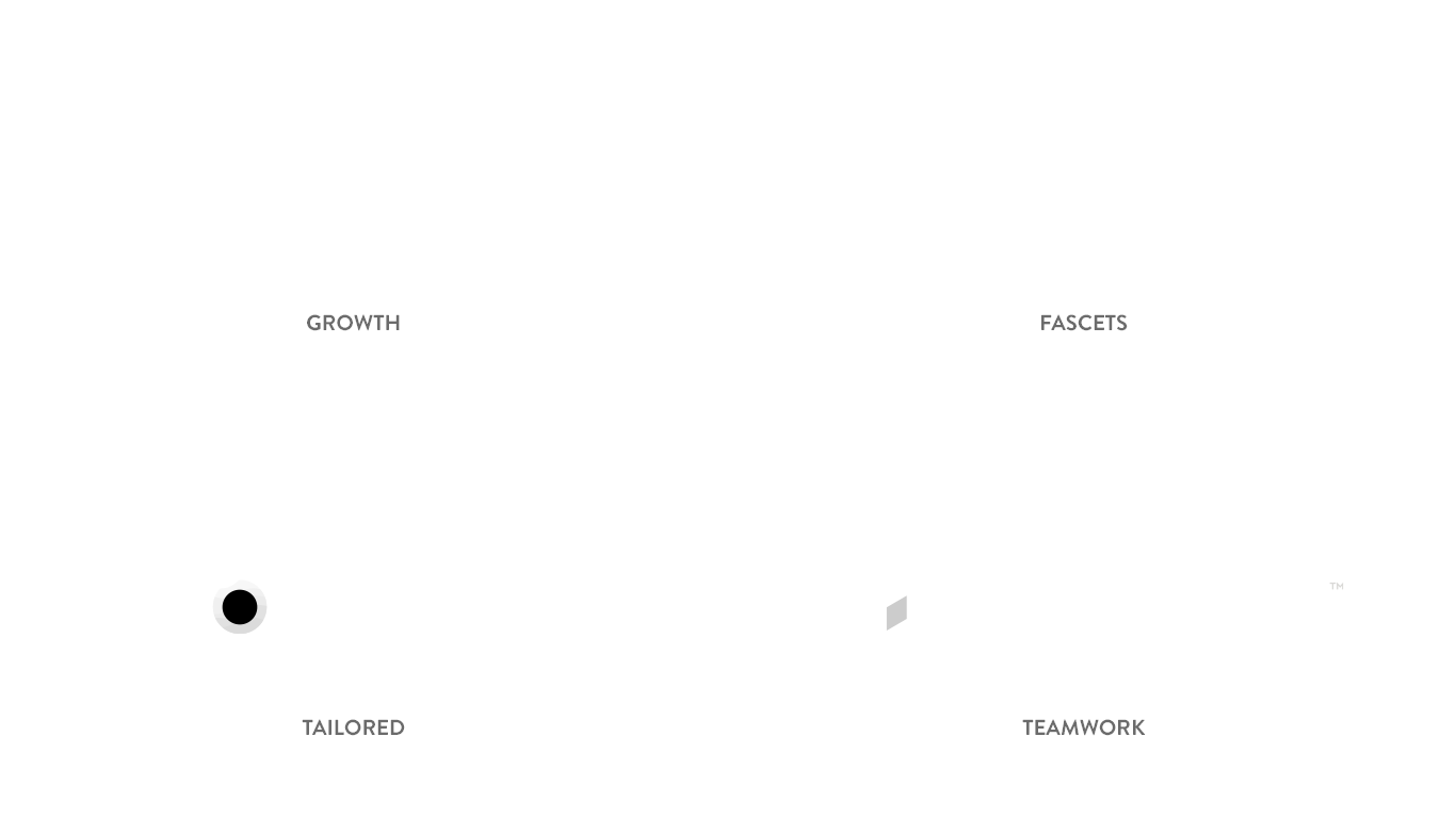
Holborn’s team was drawn to an option we named “The Hexagon Marque” (drawing on a historic term for marking, or signifying, an identity), which incorporated both cubic and hexagonal shapes. The cube symbolized solid data. The six-sided figure a beehive, a powerful symbol of symbiotic teamwork and enterprise.
![]()
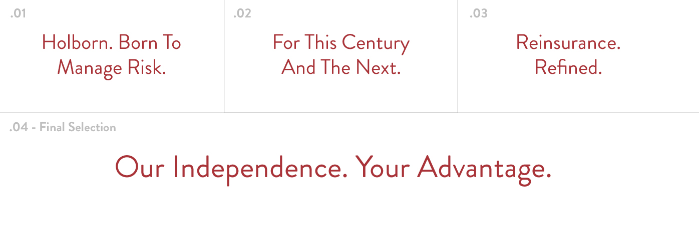
Taglines Targeted to Analytical Minds
We also put a lot of thought into the process of developing a strong tagline, offering a number of well-considered options, including “Holborn. Born to Manage Risk,” and “Reinsurance. Redefined.”
Holborn’s team weighed our proposed options and chose “Our Independence. Your Advantage.” as the one that best fits their mission and message. This simple, powerful tagline speaks to one key edge this client holds over its larger reinsurance competitors. Holborn is 100% employee-owned and “Our Independence. Your Advantage.” subtly emphasizes this unique positioning.
Protecting Holborn’s New Identity
“We had never done a ground-up marketing project before and there was a lot of hand-holding involved. e9’s team was incredibly patient.”
WEATHERLY HAMMOND | Vice President
At e9, we’re avid networkers, which means we’re not just connected to other marketing creatives, programmers and salespeople, we also know the right professionals to call when our clients require any number of services, from pastry chefs to chiropractors to highly rated attorneys in dozens of fields.
So when Holborn’s sensible team wanted to process their new intellectual property portfolio (including their tagline and icon), e9 President/Founder Conrad Strabone knew just who to call: Jordan Metzger and David Gold with the law firm of Cole Schotz, PC.
To the uninitiated, the comprehensive clearance process involved in this type of trademark/patent law looks like a puzzle with 10,000 pieces. To David, it’s a legal network he’s navigated dozens of times, which means e9 and our happy client can focus on other issues, while, in David’s words: “We take care of the heavy lifting.”
The Look Matches the Message
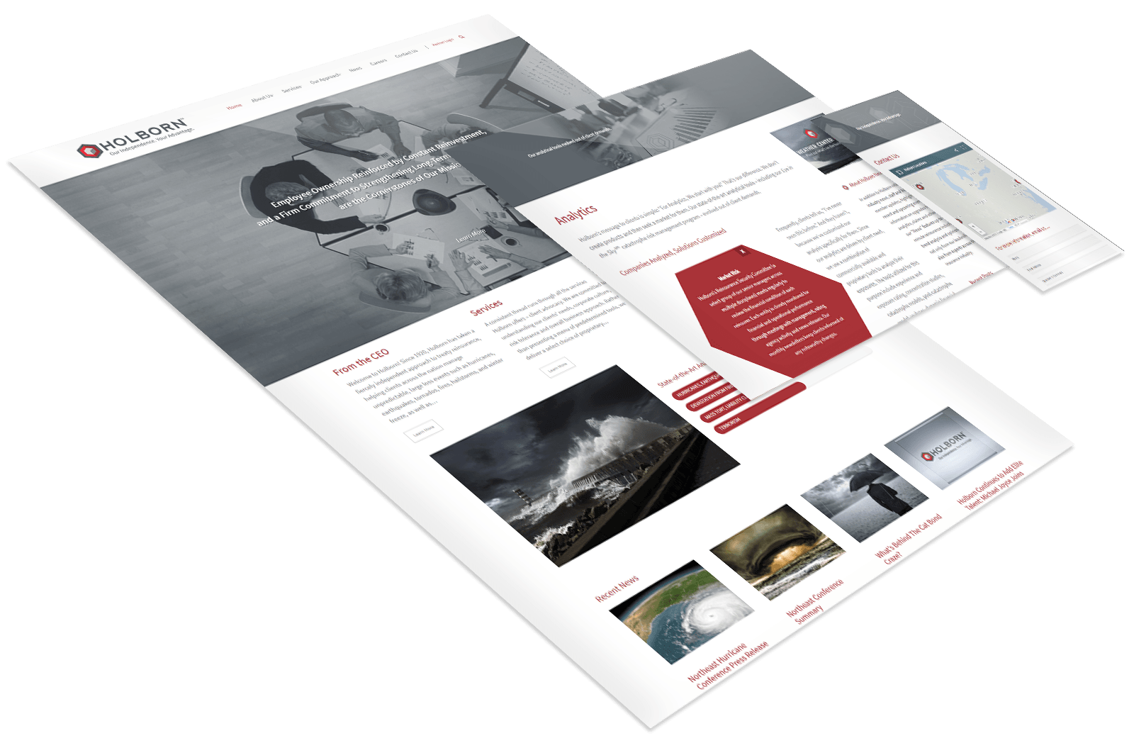
Technically, Holborn did have a website, but it was outdated, short on vital information and poorly maintained. Its look was equally outmoded and definitely off-the-mark for a national, New York-based firm that offered sophisticated, high-tech, data-driven services.
Holborn’s work was important, it’s reputation impeccable, but its website didn’t convey it.
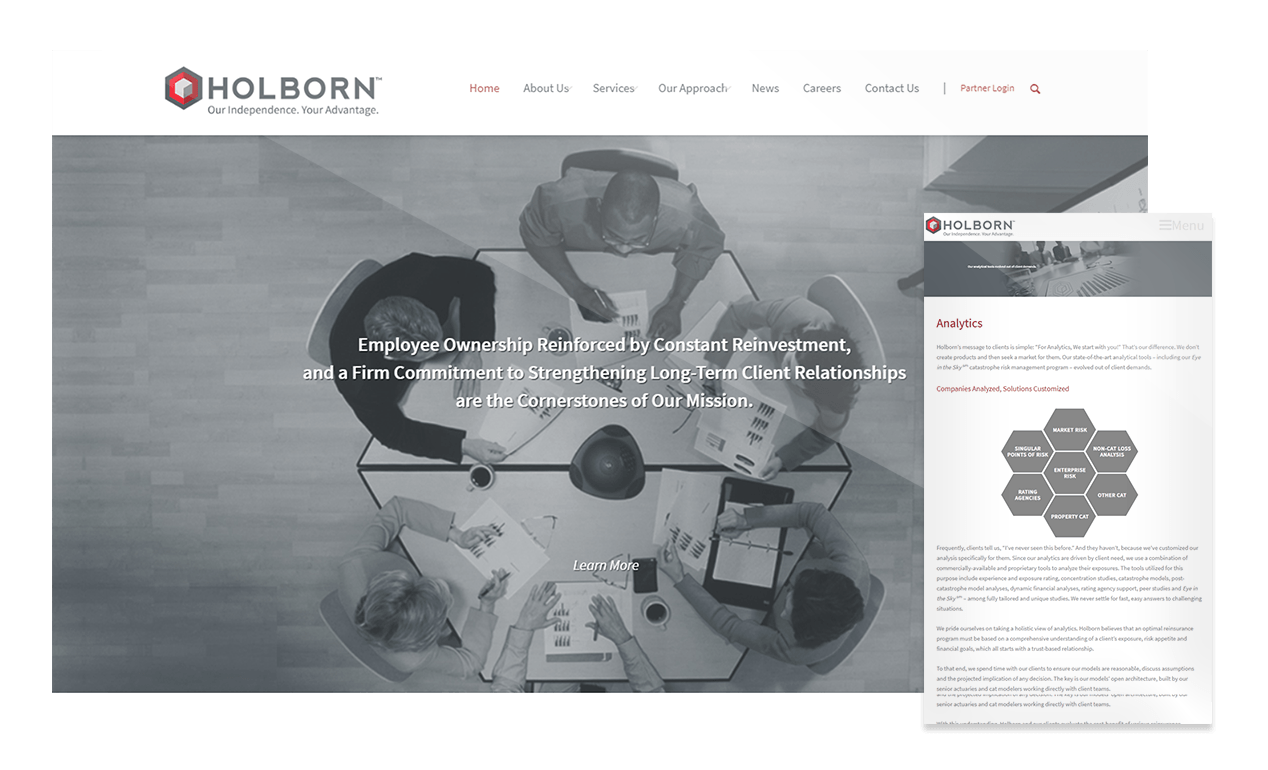
Bigger, Better but Not Too Bold
Building on Holborn’s new identity, our content-manageable website design was more open, incorporating larger images, dynamic pages, infographics (much of Holborn’s business involves the X’s and O’s of managing risk and anticipating disasters) and current testimonial quotes.
Subdued colors and black & white photography signified the firm’s seriousness of purpose. We think Holborn’s site not only makes a strong first impression but has an even stronger impact after multiple viewings.
Finding the Client’s Voice
Design and programming were primary concerns, but strong copy was just as important. To draft web copy that matched the direct, well-informed voice Holborn’s leadership wanted to convey, we assigned our veteran copywriter, whose background includes several years of insurance-industry marketing experience.
His knowledge proved essential as Holborn’s list of requests grew: from basic web copy, to corporate bios, a fresh mission statement and a number of services pages targeting an audience of insurance industry and risk management peers.
Collateral Challenges
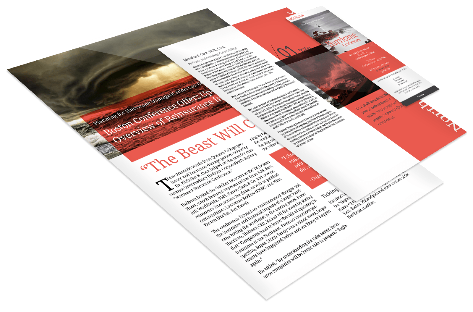
The fun and challenging tasks expanded to include press releases, a bit of ghostwriting for their President and CEO (who had a short deadline for a national insurance magazine) and an AP-style advertorial piece synopsizing a day-long disaster preparedness conference featuring industry experts, meteorologists and national news personalities.
Watch the Birdie…
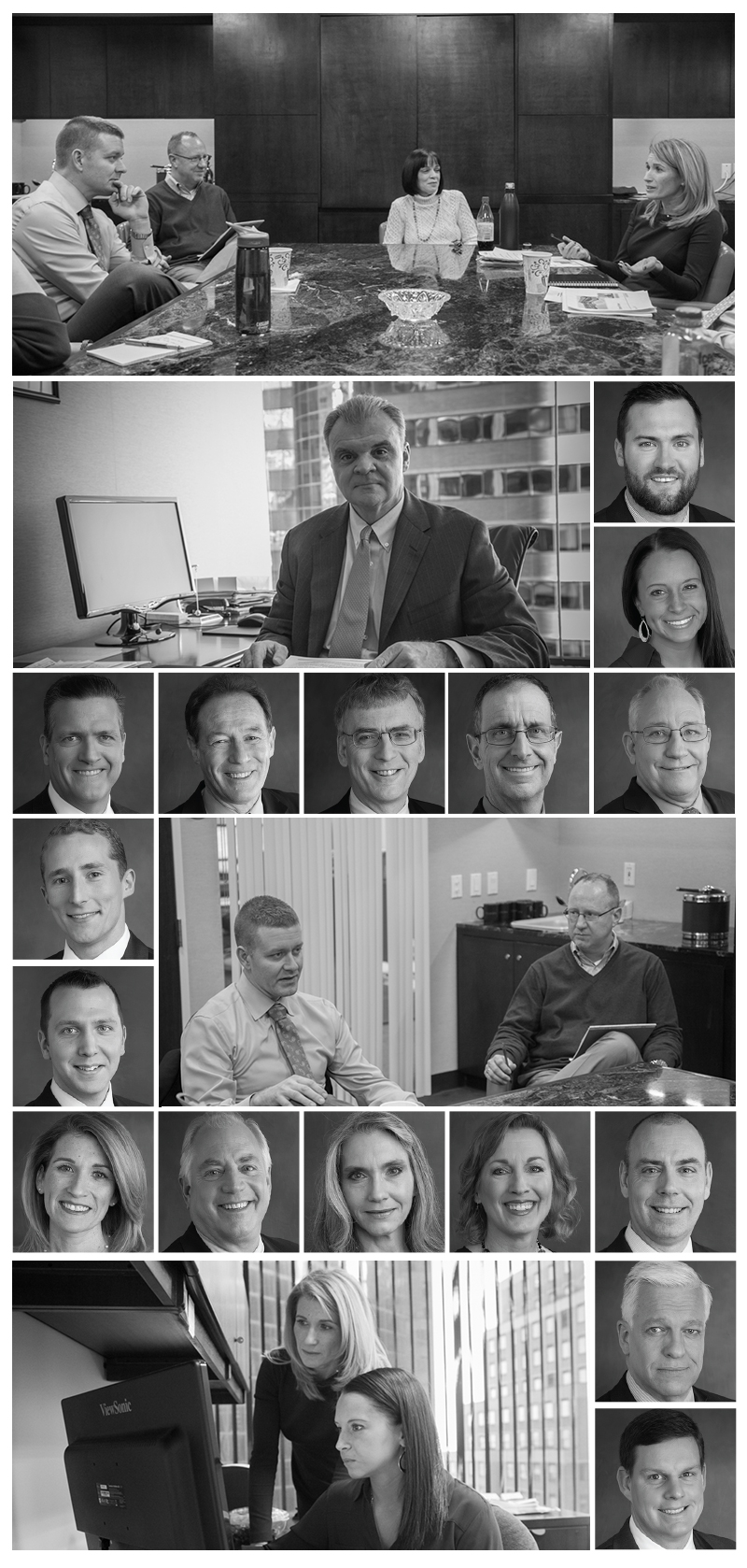
It was almost like senior year when Holborn staffers from across the country converged on New York for the firm’s annual meeting, holiday party and something unexpected, a photo shoot. This two-day gathering was the perfect opportunity to have over 75 employees (including top executives, board members and regional directors on tight schedules) pose for new headshots, all of which were included on the website, with many accompanying new executive bios.
To manage the logistics of these two busy days, e9 assembled a crack team that included an experienced portrait photographer, an art director and three stylists. The client called it “seamless.” We’ll take that.
Expanding the Brand to Print
“We’re a niche industry and you really have to understand our business. I was impressed by the research the team did and how quickly they picked things up.”
WEATHERLY HAMMOND | Vice President
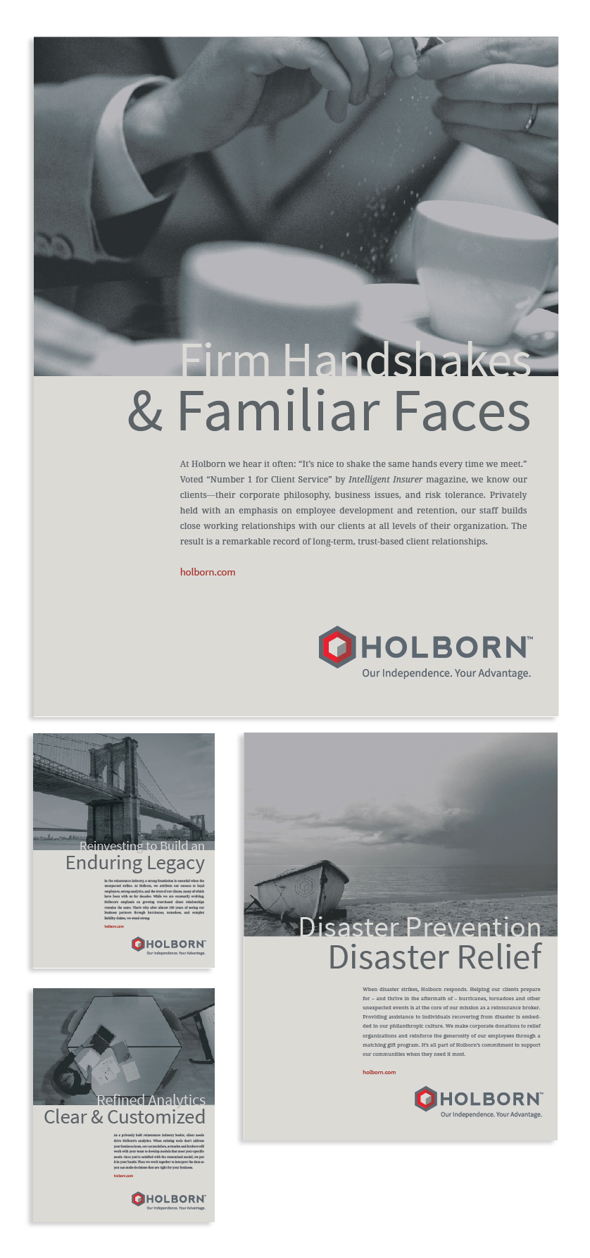
Next, Holborn asked e9 to create a unified series of full-page magazine ads. This work went through several iterations, resulting in four pieces that incorporate Holborn’s new design elements and reflect the reinsurer’s focus on teamwork, philanthropy, analytics and, as its Centennial approaches, its impeccable legacy.
The first piece featured the headline “Firm Handshakes & Familiar Faces” and zeroed in on a major Holborn strength: low employee turnover and decades-long client relationships. The ads are featured below.
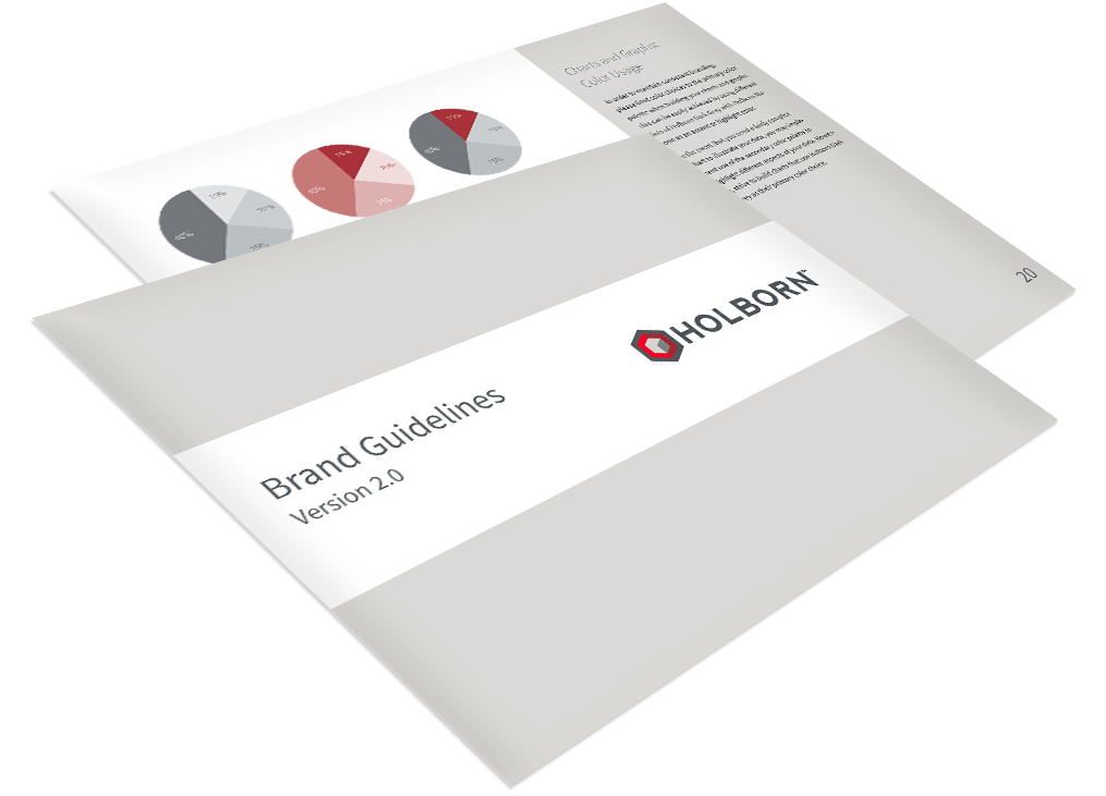
An “Almost” Sacred Identity Bible
As with all projects of this scope, e9 delivered a set of guidelines to keep the client on track as they develop their marketing in the future. “Brand Guidelines: Version 1.0”—a 20+ page manual—offered our rules for maintaining and strengthening Holborn’s corporate identity through consistent use of their new logo, tagline, identity icon, primary color palette, secondary color palette, color usage in charts/graphs, typography and more.
Sneak Peek & Promo Items Earn Great Reviews 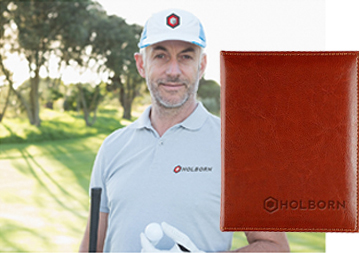
After a highly successful preview at their annual meeting in January 2015—which included viewing of an e9-produced “sizzle reel” and the introduction of Holborn-branded promotional products—Holborn’s new website launched a few months later in April.
For the promotional items, we reached out to frequent collaborator Jacklyn Lim and her firm OSM Partners. She spent time with members of Holborn’s team to develop a selection of useful in-house promotional items to really get staff members excited about their firm’s fresh new image.
While the core website, branding identity and collateral materials are complete, e9digital plans to continue working with Holborn Corporation on blogging projects, press releases, collateral materials and expanding the information and photography on their new website.
Bending Our Ears Builds Brands
“What impressed us initially was the extensive questionnaire e9 gave us. It was really thoughtful and we spent a lot of time on it. It showed they really wanted to get to know us as a company and showed a tremendous willingness to learn.”
WEATHERLY HAMMOND | Vice President
The success of this comprehensive rebranding project rests not only on the experience and hard work of e9digital’s award-winning staff, but also our commitment to listening and learning.
Before presenting Holborn with final copy or design options, we researched the client, subjected their team to a probing 10-page questionnaire and even interviewed their top executives to build a thorough understanding of their corporate culture and core business.
e9 takes the same approach with clients of all sizes. We start by asking questions (in writing and in person) to build up a true understanding of a client before we begin building brands, websites and launching marketing campaigns.
Based in Manhattan, e9 is a lean and highly focused organization. We invest in talent and experience, without frittering our money away on expensive offices and unnecessary bureaucracy. That means we can create agency-level work without the overhead, and usually in much less time.
Everyone on our exclusively US-based team—from engineers through creative directors—has put in his or her 10,000 hours, without losing their love for the work we’re doing.
WE’VE BEEN BUSY
check out these other recent projects